ATTENTION (2019) is a group of custom-made street signs intended for placement in public spaces, currently located in an unnamed alleyway (PROW 66) a few yards from Wimbledon College of Arts. This iteration was developed with this specific site in mind, featuring 40+ reimagined texts and symbols from an active photo collection of raw graffiti found over time across different places.
Made of industrial prints on corrugated polypropylene, the signs hope to highlight awareness, visibility and perceptions by transforming otherwise negligible, peripheral or ephemeral messages into familiar designs that many people often see and understand.
With elements of psychogeography and relational aesthetics, the images collectively simulate an unexpected encounter that aims to stimulate a reflection on a range of human experiences through fragments of vaguely universal ideas, each one seemingly expressed compulsively yet anonymously through imprints left behind in shared spaces.
This project continues an ongoing series of works exploring the contents and aesthetics of found graffiti, which loosely began in 2011 and so far includes a photo book (Poet Fool, 2016), pigment prints (Signs No 1 & 2, 2017), a video slideshow (HEY, 2018), and a group of postcards (Jeder Traum Hat Seinen Weg, 2018).
The work also echoes recurring themes and methods in the wider practice, often attempting to explore the potential of traces and collections through organic accumulations of images and data, including projects like There is no there, there (2019) and Cracks (2019).
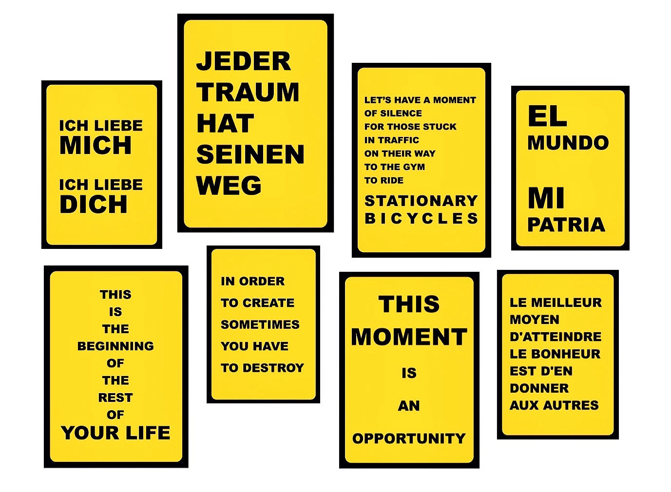
The idea of found graffiti as street signs first materialised in a pop-up exhibit in September 2018, where eight samples were presented at the time, pictured below. More colours, texts and other adjustments were added in the latest version.
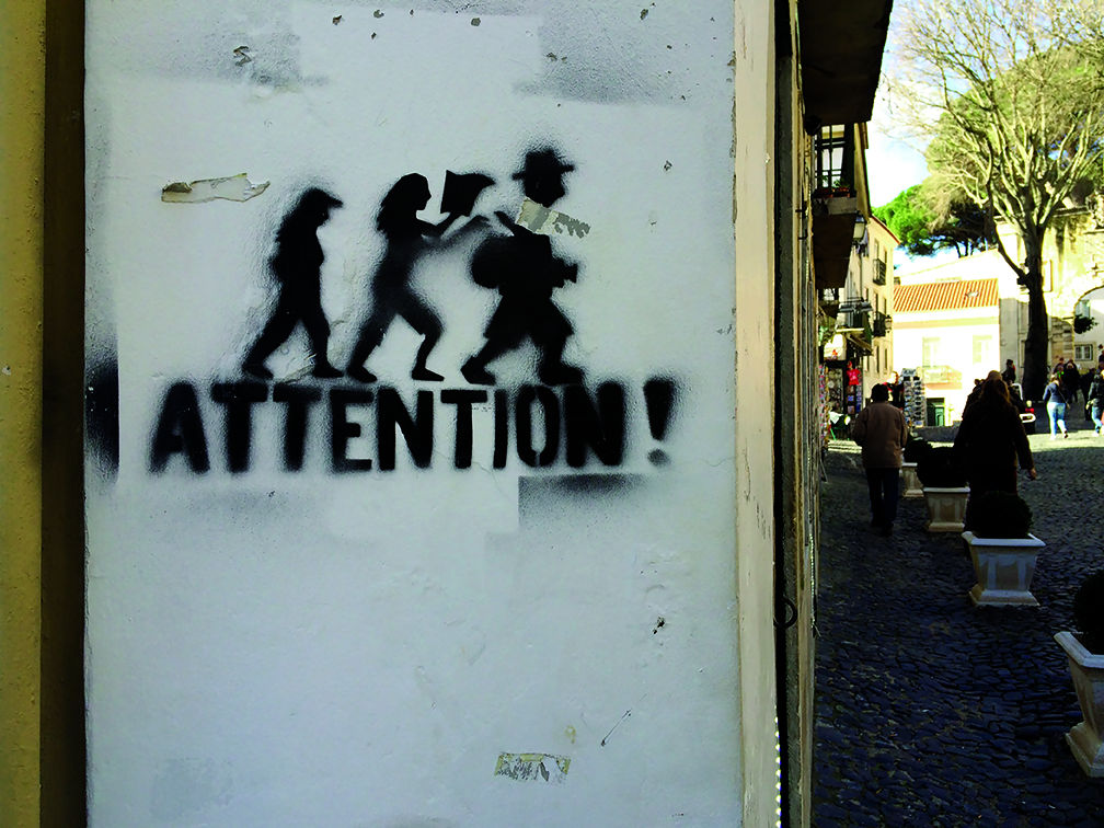
Found graffiti: The title of this project originated from this image, part of a collection of imprints reconsidered as artefacts and/or materials, typically occuring as stencils, scribbles, stickers, doodles and etchings in public spaces
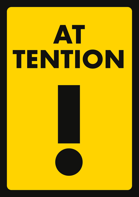
Street sign by design: Found imprints are transformed into familiar signs for this work in an effort to extend its visibility and context beyond fixed and often peripheral points of origin
CONTEXTUAL RESEARCH
Texts, also referred to as language, words, lettering and type in various artistic contexts, have an extensive history in art: a device, material and subject matter used widely from conceptualism and pop art to relational aesthetics.
Contemporary artist Mark Titchner is a key figure that reflects my own recent approach to this area. His works often uses texts to convey a wide range of personal and socially-relevant messages, taking on various forms from vinyl prints (I want a better world, 2012) to video (Be Not Content, 2017) and other media in between. His use of digital technology and graphic design elements also relate to my own process on some projects, though my style at this time lean toward more simplistic aesthetics if compared to his more eleborate and intricate tendencies.
The clean and modern look favoured by Barbara Kruger in her graphic works might be more recognisable in my own visual experiments. Her bold yet simple compositions of words (and sometimes found images) resonate with my current tastes, together with my desire to similarly engage in public interventions, which she has done successfully over the years through billboards and murals, such as the reissued Questions (1990/2018) commissioned by MOCA LA.
Other artists that contributed to my understanding of texts in art include: Christian Marclay for his collection of words that represent sound; Bob & Roberta Smith for his socially-aware banners, panels and placards; Bill Drummond for using texts as part of paintings, sculptures, performances and political interventions; Jenny Holzer for her bold use of language to convey ideas clearly through posters, led signs and other media; and Robert Montgomery for the poetry of his public billboards and light installations.
My interest in texts is part of wider efforts to observe communication systems and ways of seeing. The similarly titled book Ways of Seeing (1972, Penguin Books) by John Berger has been a regular point of reference since I was an undergraduate. I read it again in the process of this project to remind myself to look openly and recognise any potential meaning or value in the words, images, and other signs I see.
This Means This, This Means That (2012, Laurence King Publishing) by Sean Hall, a book on semiotics, served as a reminder of the richness of this territory. There is complexity in how people express themselves based on personal, cultural and situational specificities, and that these can be (re-/mis-) interpreted in many different ways.
"Signs can be easily misunderstood," Hall writes, "because they can mean something other than themselves. Signs are not isolated. They are dependent for their meaning on the structures that help to organise them, along with the contexts in which they are read and understood.”
With this awareness in the context of my project, I attempted to transform some raw graffiti - which would otherwise be neglible, confusing or even repulsive to some - into somewhat digestable and recognisable images: as street signage that most people might feel comfortable to see and consider because of its benign universality. And perhaps in doing so, the ideas, stories and messages presented with it can be better received and understood by more people who may now look.
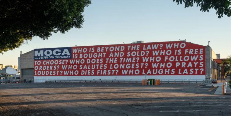
Barbara Kruger [on text as intervention]
Questions (1990/2018)
Large-scale public wall mural
Commissioned by MOCA LA
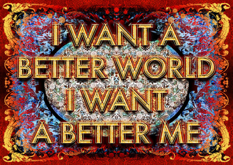
Mark Titchner [on text as digital design]
I want a better world (2012)
Digital print on vinyl
Dimensions variable
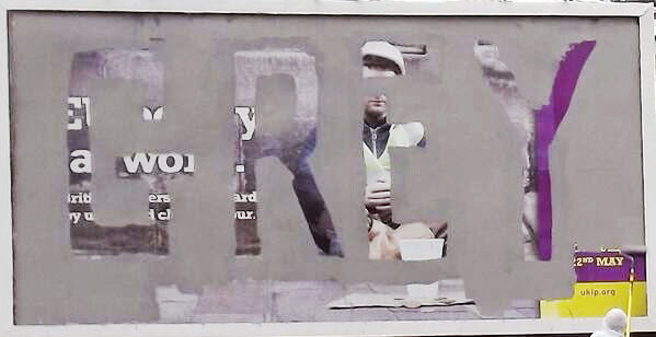
Bill Drummond [on text as painting]
untitlled (Grey) (2014)
painting intervention on UKIP billboard